#30DayMapChallenge 2025
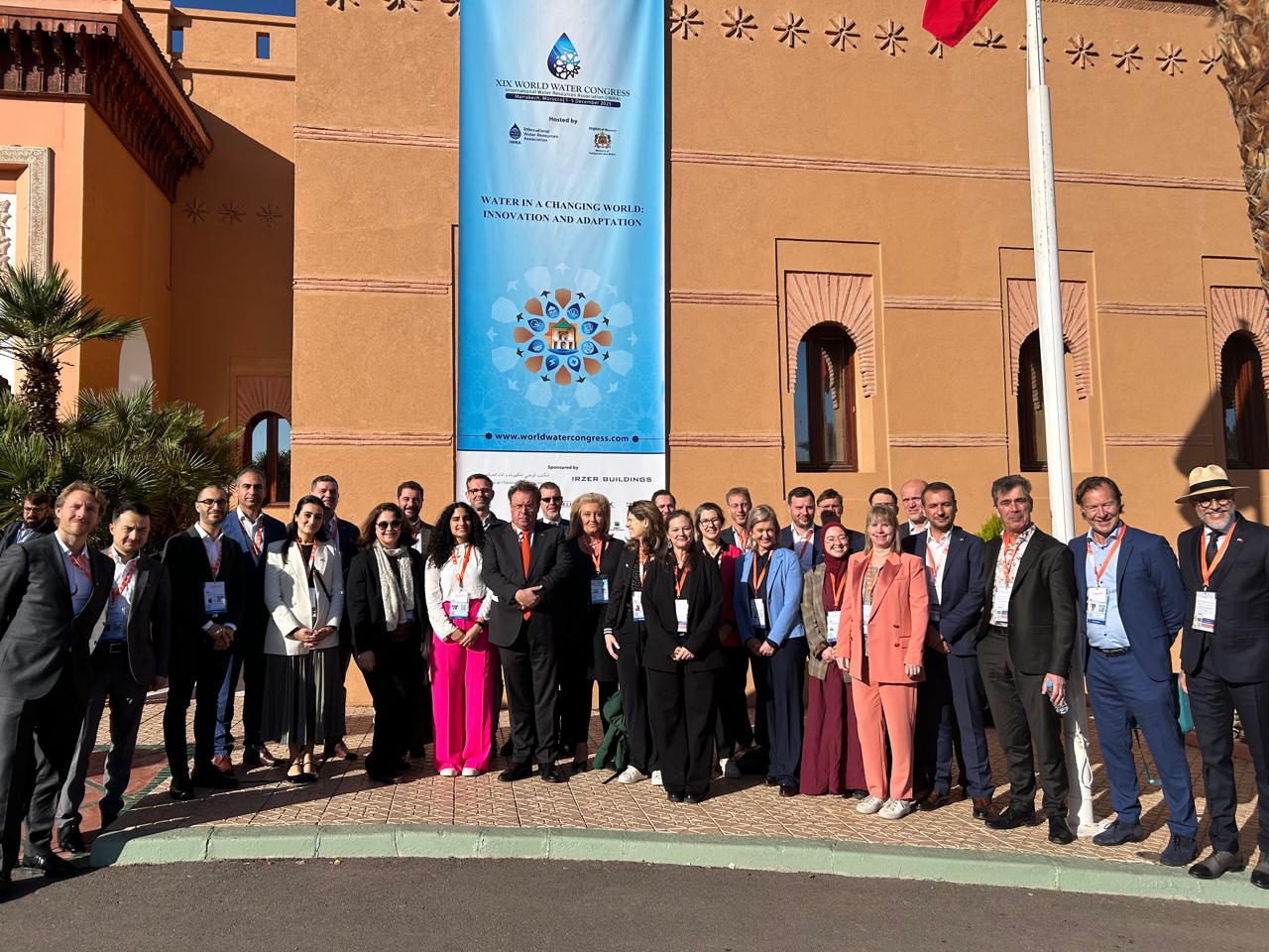
Taking part in the #30DayMapChallenge is always a test of creativity and endurance, but November 2025 proved to be especially demanding. The month began with the grandeur of Carmina Burana concerts at MECC Maastricht, performed with Brabantkoor (I was a tenor in the choir) and the Jussen Brothers, and quickly unfolded into a whirlwind of commitments: delivering a QGIS training in Groningen for the GEO2MEET reskilling programme, teaching at IHE Delft, arranging a visa for Algeria, performing Beethoven 9th Symphony with the Delft Symphony Orcherstra, singing at the Night of the Film Music in Amsterdam's Ziggo Dome with Nederlands Concertkoor and Metropole Orkest, contributing to a Water Day seminar in Algeria, performing Händel's Messiah with Sursum Corda in Schiedam, and finally joining the Dutch trade mission for water in Marrakesh, Morocco.
With such a packed schedule, creating thirty maps in thirty days was no small feat. This year, I had to keep my cartography simple, often producing maps in just a couple of hours. Yet the very busyness of the month provided inspiration: each experience, from music to teaching to international collaboration, sparked ideas that found their way into the maps.
In the sections below, I'll walk through each of the thirty maps, sharing the process, the challenges, and the stories behind them.
Day 1: Points
For the first day of the challenge, my map is inspired by where I've been since Tuesday: Maastricht, performing with Brabant Koor and the Jussen Brothers in a spectacular modern staging of Carl Orff's Carmina Burana, conducted by Louis Buskens. The production combines choir, orchestra, dancers, fire, and light design: an unforgettable experience that adds a dramatic layer to the city's already rich historical atmosphere.
The map focuses on place names ending in -tricht, -drecht, or -trecht, all derived from the Latin trajectum, meaning "ford" or "river crossing." Maastricht itself comes from Mosa Trajectum, literally "crossing of the Meuse." These suffixes are linguistic fossils of Roman infrastructure, marking strategic points where rivers could be crossed, either by shallow fords or bridges. Such locations were vital for movement, trade, and settlement, and their names still echo that legacy today.
I used a regular expression in QGIS to select relevant place names from data downloaded from OpenStreetMap with the QuickOSM plugin:
Vector tiles from Cartiqo, accessed via the MapTiler plugin, provided a clean and flexible base layer.
On LinkedIn I got some useful comments: Haastrecht was missing and Duivendrecht is above the Roman Limes, so it's probably from later times.
Day 2: Lines
For today's theme, I turned to Rotterdam's watery past, mapping street names that preserve echoes of canals, dikes, and drainage systems. These names form a network of lines across the city. Some still marking active waterways, others tracing paths that have long since been filled in.
Rotterdam's urban fabric is full of linguistic reminders of its hydraulic history:
- Singel – canal or moat, often encircling a city
- Boezem – drainage basin or overflow canal in polder systems
- Kade – quay or embankment
- Sloot – ditch for field drainage
- Wetering – man-made watercourse or drainage channel
- Gedempte – "filled-in," marking former canals now converted into streets
- Vliet – small stream or canal, natural or semi-natural
- Vaart – navigable canal, often used for transport
- Haven – harbor or dock, central to Rotterdam's maritime identity
- Dijk – dike or levee, protecting land from flooding
Streets like Goudsesingel, Coolsingel, Gedempte Botersloot, and Boezemweg trace the outlines of former waterways, embedding centuries of water management into the city's street grid.
Rotterdam itself takes its name from the Rotte, a modest river dammed in the 13th century to create a settlement: Rotte-dam. Over time, the river was canalized, and many sections were eventually filled in as the city expanded.
Around 1915, the Coolsingel, once a wide canal, was filled in to create a grand boulevard.
After the 1940 bombing marking the start of the Second World War in the Netherlands, rubble was used to partially fill the Rotterdamse Schie, turning destruction into transformation.
As the port grew, many havens were filled in to make way for modern roads and infrastructure.
These waterlines became literal foundations for rebuilding, shaping Rotterdam's identity as both a city of resilience and of water.
Streets were selected from OpenStreetMap using the QuickOSM plugin in QGIS. The following expression was used to select the streets with the toponyms:
regexp_match("name", '.*(singel|boezem|sloot|wetering|gedempte|vaart|vliet|kade|haven|dam|sluis|water|dijk).*')
A customized MapTiler vector tile was used as a background.
Day 3: Polygons
Despite the packed schedule today, I carved out time to create an animated choropleth map visualizing CO₂ emissions per capita. Working with polygon data provided a clear way to highlight national differences in emissions, and the animation added a dynamic perspective to how these values vary across the globe.
🗂️ Open Data: Our World in Data
🛠️ Open Source Tools: QGIS for map creation, GIMP for animation
📚 Tutorial: GIS OpenCourseWare
It's disheartening that climate change barely featured in the recent Dutch national election campaigns. As global temperatures rise and extreme weather events become more frequent, sidelining this issue is not an option. Maps like this serve as a reminder of the urgency: emissions are not abstract numbers, but drivers of real-world consequences.
We need to refocus, take bold action, and drastically reduce greenhouse gas emissions before the consequences become irreversible.
Day 4: Data challenge - My data
For today's theme, I turned to a dataset that has become something of a tradition. Each year around this time, my colleague Amitangshu Acharya asks me to prepare a map showing the geographic distribution of the new MSc students in Water and Sustainable Development at IHE Delft Institute for Water Education. It's always a rewarding exercise, not only for its cartographic challenge but also as a moment to reflect on the truly global reach of our program.
This year's edition was created in QGIS, using Natural Earth country polygons as the base. To give the visualization a more engaging perspective, I used the Globe Builder plugin from Gispo, which allowed me to present the data on a world map that highlights the diversity of student origins.
Seeing the spread of countries represented is always inspiring. Our classrooms bring together perspectives from across continents, cultures, and contexts. It's a reminder of how interconnected water and sustainable development challenges are, and how valuable it is to learn from one another in such an international environment.
Day 5: Earth
For today's theme, I created a map that overlays oil and gas fields with recorded earthquakes across the Netherlands. The goal was to connect the geology beneath our feet with the human and political consequences felt at the surface.
Groningen has a long history of gas extraction, and its residents have endured decades of induced seismicity. Limburg, with its legacy of coal mining, has also experienced tremors linked to human activity. These earthquakes are not just scientific data points, they represent damaged homes, shaken communities, and national debates about responsibility and compensation.
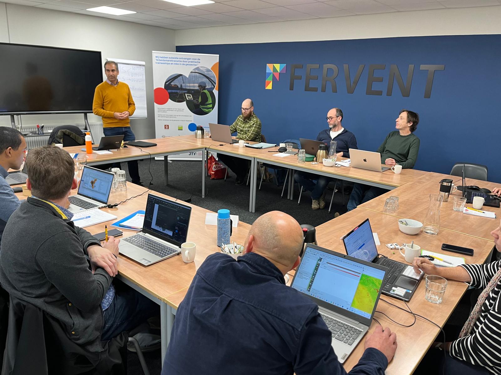
The map was inspired by my teaching work in Leek (near Groningen) over the past two days. I teach QGIS and Mergin Maps as part of a reskilling program organized by Fervent Opleidingen and GEO2MEET.
Day 6: Dimensions
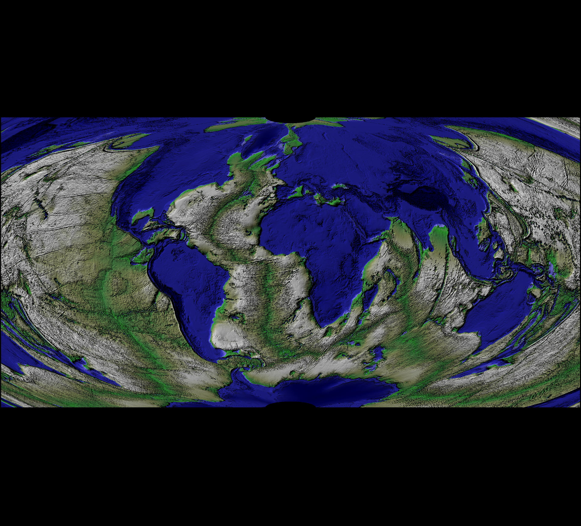
For today's challenge, I experimented with an unconventional 3D visualization in QGIS. Instead of using terrain elevation, I mapped evapotranspiration as the vertical dimension, creating a striking perspective on water dynamics.
- Base layer: FAO WaPOR Level 1 AETI image (2008), representing actual evapotranspiration values.
- Overlay: A Google Satellite image, draped across the surface to provide geographic context.
In this visualization of Algiers (Algeria), vegetated and agricultural zones rise above the urban fabric, highlighting areas with higher evapotranspiration. The result is a vivid reminder of how land use and vegetation directly influence water cycles. By reimagining elevation in terms of evapotranspiration, the map emphasizes the hidden dimensions of water dynamics that shape both ecosystems and cities.
Day 7: Accessibility
For today's theme, I mapped something that is becoming increasingly inaccessible: visa-free travel. Using a bivariate choropleth, the visualization highlights two dimensions of global mobility for each country:
🛫 Outbound openness – how many countries its citizens can visit without a visa
🛬 Inbound openness – how many countries allow its citizens to enter visa-free
The result is a stark picture of global mobility inequality and a worrying trend of deglobalisation. In recent years, shifting geopolitics, trade tensions, migration fears, and the rise of right-wing politics have led to more restrictive visa policies. Borders are tightening, reciprocity is eroding, and the freedom to move, once a hallmark of global cooperation, is now a privilege enjoyed by fewer and fewer people.
This isn't just about tourism. For international researchers, students, and professionals, restrictive visa regimes make it harder to:
Participate in global projects
Attend conferences
Collaborate across borders
Accessibility is not only about infrastructure, it's about policy, openness, and the freedom to connect. The map serves as a reminder that accessibility is political, and the world is far from equally open to everyone.
- Data source: 2025 Passport Index DatasetTools: QGIS with the
- Bivariate Color Polygon Renderer plugin
Day 8: Urban
On World Urbanism Day, I explored urbanization through the lens of paved surfaces. The map highlights how much of our land has been covered by asphalt, concrete, and other impervious materials, an important factor in understanding climate resilience.
The map shows the most paved-over municipality in the Netherlands is Krimpen aan den IJssel, with 43.3% of its land area paved (excluding buildings). Within it, Kortland-Noord stands out even more, with nearly 53% paving.
This visualization is based on the Imperviousness Map of the Netherlands, created by the Friedenau Society for Climate Adaptation Services (CAS). CAS is a not-for-profit organization dedicated to understanding and addressing the impacts of climate change on the Dutch landscape and its citizens. They are also the custodian of the KlimaatEffectAtlas, which brings together expertise on climate adaptation and mitigation.
Data sources: AHN LiDAR data + BGT raster
Resolution: Cloud Optimized GeoTIFF (COG) at 25 cm
Applications: Used in CAS's Neighbourhood Dashboard (Buurtdashboard), helping communities better understand and respond to urbanization and climate challenges.
I'm happy to have contributed to this map as scientific advisor of the Friedenau Society. By visualizing impervious surfaces, we can better grasp the pressures urbanization places on water management, heat stress, and ecological systems, and take steps toward more sustainable urban planning.
The video below explains more about the map:
Day 9: Analog
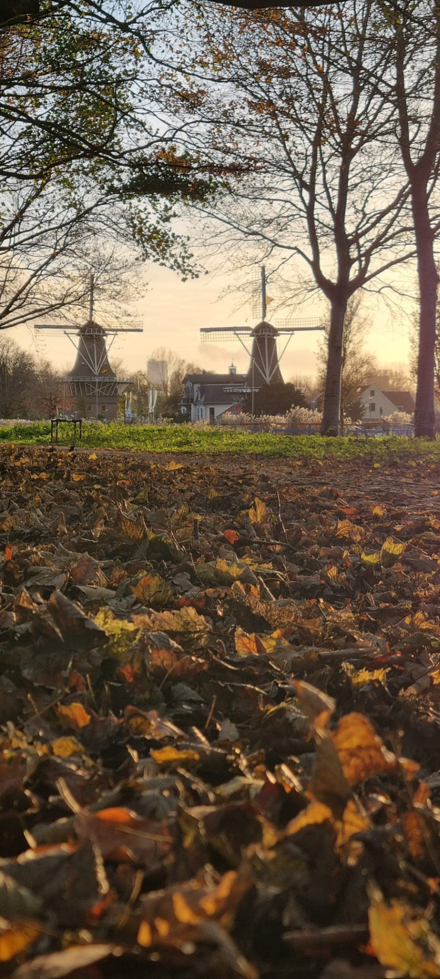
For today's theme, I stepped away from the digital screen and embraced something more tactile. It was a beautiful autumn day here in the Netherlands, so I collected autumn leaves in Kralingse Bos (Rotterdam, the Netherlands) and used them as the background for my map: a natural canvas that brought seasonal warmth into the cartography.
On top of this textured backdrop, I highlighted in orange the European countries with official QGIS User Groups. The data comes from the QGIS Easter Egg, a playful but informative way to explore the global reach of the QGIS community.
Learn more about QGIS Easter Eggs in this fun video by Ujaval Gandhi and his daughter:
Day 10: Air
For today's theme, I animated mesh layers of hurricane tracks. As the swirling motion unfolded, I couldn't help but think of Vincent van Gogh's Starry Night. The resemblance in movement and energy inspired me to experiment with similar colours and styles, blending science and art into one visualization.
In the animation, you see Hurricane Melissa, which recently struck Jamaica. The map was made with QGIS, using data from Copernicus ECMWF.
At first glance, this piece looks like cartographic art. But behind the swirls of colour lies immense sadness. Allison Pearce, alumna of IHE Delft Institute for Water Education and based in Jamaica, reached out to share the devastating reality: families have lost homes, livelihoods, and stability in the wake of Hurricane Melissa. A crowdfunding initiative has been launched to support 10 families in urgent need.
If this map moved you, please consider turning that feeling into action. Donations, no matter the size, will help bring relief and hope.
Day 11: Minimal
For today's theme, I went back to the essence of cartography: Rotterdam defined only by water and land.
This minimal map highlights the municipality boundaries and traces the evolution of Rotterdam's port areas. From its beginnings in the city center, the port gradually expanded westward, eventually reaching the North Sea with the creation of Maasvlakte and later Tweede Maasvlakte.
Rotterdam was once the largest port in the world, a title it held for decades. Today, it remains a global hub of trade and logistics, ranking as the third-largest port worldwide. The city's identity is inseparable from its port, and its expansion tells the story of Rotterdam's role in global commerce.
🛠️ Software: QGIS
🌍 Basemap: Vector tiles from MapTiler (via the MapTiler plugin)
📊 Data: Municipality polygon from Centraal Bureau voor de Statistiek, accessed via the PDOK Services plugin
Day 12: Map from 2125
For this challenge, I imagined the delta of the Netherlands in the year 2125 under a worst-case scenario of 2.5 meters sea level rise caused by accelerated ice sheet melt.
🛠️ Software: QGIS
🌍 Data: SRTM90 elevation data, downloaded via the OpenTopography DEM Downloader plugin
🗺️ Process:
- Identified areas below 2.5 m above current sea level
- Converted the mask into a dissolved polygon
- Styled with the raster image renderer, using sampled water colour for realism
- Added MapTiler raster tiles (via the MapTiler plugin) for satellite imagery, blended with exaggerated elevation for dramatic effect
- Rendered in 3D using the Qgis2threejs plugin
The map assumes:
No human adaptation or protective measures included
Non-submerged landscapes remain unchanged
Potential collapse of the Atlantic Meridional Overturning Circulation (AMOC) not accounted for
The AMOC is a major ocean current system that redistributes heat globally. Its collapse could drastically alter weather patterns, intensify sea level rise along European coasts, and disrupt ecosystems.
This visualization is not a prediction, but a stark reminder of what unchecked climate change could mean. A massive sea level rise would reshape coastlines, displace millions, and challenge the very foundations of our infrastructure and society.
The urgency is clear: we must reduce greenhouse gas emissions now to prevent these worst-case scenarios from becoming reality.
This video shows how to download digital elevation models and bathymetry from OpenTopography with the OpenTopography DEM Downloader plugin:
Day 13: 10 Minute Map
Next week I'll be teaching GIS at IHE Delft Institute for Water Education in the MSc program on Water and Sustainable Development, focusing on the Mara River Basin. As part of their poster presentations, students need to create a map in QGIS, but they don't have the luxury of spending hours on catchment delineation. That's where the 10 Minute Map approach comes in handy!
Data used:
- HydroSHEDS – Hydrological data and maps based on SHuttle Elevation Derivatives at multiple Scales. Derived from NASA's SRTM elevation data, HydroSHEDS provides high-resolution hydrographic information widely used for river networks, watershed boundaries, and hydrological modeling.
- MapTiler Vector Tiles – Global basemaps stored as vector data (points, lines, polygons) rather than raster images. This allows smooth zooming, customizable cartography, and lightweight performance. Perfect for quick map creation in QGIS and invaluable during the #30DayMapChallenge.
Watch the video here to create the map yourself:
Day 14: Data challenge - OpenStreetMap
Although this year's challenge doesn't include a vintage map theme, one I always enjoy, I decided to bring a bit of history into today's task. Using QGIS, I styled current OpenStreetMap data of Rhode Island in the aesthetic of 19th‑century maps.
Method:
- Polygon boundaries were given a Raster Image Fill, with colours sampled directly from old maps of the region.
- Geometry generators were used to style the water bodies, adding depth and authenticity to the look.
- Styled in QGIS
- Exported as SVG
- Refined with Inkscape
- Final touches in Canva
This video by Klas Karlsson shows how to create the shorelines with geometry generators:
Day 15: Fire
For today's theme, I explored the density of fire stations across the Netherlands. Fire safety is a critical part of urban resilience, and mapping their distribution reveals how infrastructure aligns with official service zones.
Method:
- Data extraction: Fire station locations were downloaded using the QuickOSM plugin in QGIS.
- Visualization: Styled with the heat map renderer to highlight areas of higher concentration.
- Context: Fire service zone polygons from the Centraal Bureau voor de Statistiek (CBS), accessed via the PDOK Services plugin, were added to provide administrative boundaries.
- Labels: Each zone was annotated with the number of fire stations, making the distribution clear at a glance.
More about rendering points as heat map in this tutorial at GIS OpenCourseWare and this video:
This video shows how to download vector data from OpenStreetMap with the QuickOSM plugin:
Day 16: Cells
For today's theme, I turned to the geography of incarceration, mapping the spatial distribution of prisons across Europe. The visualization highlights how correctional facilities are spread across the continent, offering a stark reminder of the infrastructure built around confinement.
Method:
- Data extraction: Prison locations were pulled from OpenStreetMap using the QuickOSM plugin in QGIS.
- Visualization: Rendered as a heatmap, showing areas of higher density and clustering.
- Basemap: A MapTiler vector tile backdrop provided geographic context and clarity.
Day 17: A new tool
For today's theme, I explored JupyterGIS, a Python-based mapping interface that brings spatial data exploration directly into Jupyter Lab. It's a refreshing alternative to traditional GIS software: lightweight, scriptable, and ideal for reproducible workflows.
Using JupyterGIS, I created a global map of transboundary aquifers, drawing from open data by IGRAC. These aquifers are invisible lifelines that cross borders and sustain millions, yet they often remain underrepresented in global mapping efforts.
To enrich the context, I layered in major river basins from HydroSHEDS and styled the visualization with a raster tile backdrop from OpenStreetMap.
The result is a minimalist yet data-rich visualization that highlights the delicate interplay between groundwater and surface hydrology.
What sets JupyterGIS apart is its support for interactive, real-time collaboration. You can co-edit code and maps live, annotate spatial features, tweak styles, and explore data together in a shared notebook environment. This makes it a powerful setup for remote teamwork, teaching, and open science.
I'm excited to see how JupyterGIS evolves, especially in terms of analysis and styling possibilities. It's a tool that bridges coding and cartography in a way that feels both modern and accessible.
Day 18: Out of this world
For today's theme, I left Earth behind and ventured to Mars, visualizing the planet's surface with the blended MOLA + HRSC elevation dataset from U.S. Geological Survey (USGS) Astrogeology. This dataset combines laser altimetry from NASA's Mars Global Surveyor with stereo imagery from ESA's Mars Express, resulting in a stunningly detailed topographic model at 200 m resolution.
Method:
🛠️ Software: QGIS
🎨 Styling: DEM styled with a custom Martian palette and hillshade to emphasize rugged beauty
🌍 Visualization: Explored the new 3D Globe view in QGIS for the first time. A great way to experience planetary data
Day 19: Projections
When teaching map projections, I often use the metaphor of peeling an orange: try to lay the peel flat on a table, and it inevitably breaks apart. That's the essence of distortion—our round Earth doesn't translate neatly into flat space.
For today's challenge, I took that metaphor literally. I created a world map made of orange peel, styled in the polar stereographic projection.
Method:
🛠️ Software: QGIS
🌍 Data: Natural Earth
🎨 Finishing touch: Canva
Day 20: Water
Time was short today, so I went for something simple but playful. I created a map I'm calling Invearth. I've used the Mapzen Global Terrain layer from the QGIS Browser panel. By inverting the relief, just switching the rendered hillshade in QGIS to Southeast, I produced an inverted terrain model that flips our perception of the planet.
Day 21: Icons
For today's theme, I mapped my week using emojis as icons: a playful way to capture both geography and activities. Each symbol marks a place and moment, turning the map into a diary of movement and experiences.
📍 IHE Delft (Mon–Wed): Teaching GIS, sharing spatial thinking with students.
🎼 Amsterdam (Vossius Gymnasium, Wed evening): Rehearsal with Nederlands Concertkoor for Night of the Film Music and Mahler's Symphony No. 8.
🎻 Hilversum (Muziekcentrum voor de Omroep, Thu): Rehearsal with Metropole Orkest for Night of the Film Music.
🏰 Wassenaar (Kasteel de Wittenburg, Thu evening): Reception by the Algerian Embassy celebrating the 71st Anniversary of the Revolution 🇩🇿. An evening of food, music, and inspiring conversations.
🛂 The Hague (Fri): Picked up my passport with visa for Algeria, preparing for next week's seminar on water organized by the Dutch Embassy in Algiers and RVO.
🎶 Amsterdam (Ziggo Dome, Fri–Sun): Singing in the choir for Night of the Film Music with Metropole Orkest, an annual highlight full of cinematic sound and spectacle. Here's a clip from one of the concerts.
Day 22: Data challenge - Natural Earth
Today's challenge was all about exploring the Natural Earth dataset. With limited time, I leaned on my own tutorial to create a population map in QGIS using Natural Earth data.
This straightforward process highlights how accessible and versatile Natural Earth is for quick cartographic projects:
- Symbolizing point data with varying sizes to represent population values
- Adding styling tips for clarity and aesthetics
- Creating a clean legend in the Print Layout for professional presentation
These videos illustrate the process:
Day 23: Process
For today's theme, I explored the dynamics of flow directions in the French Alpes, a key factor in understanding how surface water and materials move through the landscape.
Workflow:
- Starting point: A 5 m RGEALTI DTM from IGN France
- Processing: The new native Fill Sinks (Wang & Liu) tool in QGIS (based on the SAGA algorithm) to calculate flow directions
- Conversion: With the Crayfish plugin, results were transformed into a GRIB mesh and styled with arrows in the mesh panel
- Visualization: Finally, the flow directions came alive in the QGIS 3D view
This video shows the process:
Day 24: Places and their names
For today's theme, I explored the fascinating legacy of cope ontginningen, medieval contracts that shaped much of the Dutch landscape. A cope was an agreement between landowners (such as the Count of Holland or the Bishop of Utrecht) and settlers, granting the right to drain and cultivate peatlands.
The imprint of these contracts still lives on in toponyms:
- Villages ending in ‑cop, ‑koop, or ‑kop, such as Nieuwkoop, Boskoop, Benschop, Gerverscop, Willeskop, Teckop, all trace their origins to these medieval arrangements.
- This naming tradition spread with Dutch settlers to northern Germany and even Poland, leaving a linguistic and geographic footprint across Europe.
Day 25: Hexagons
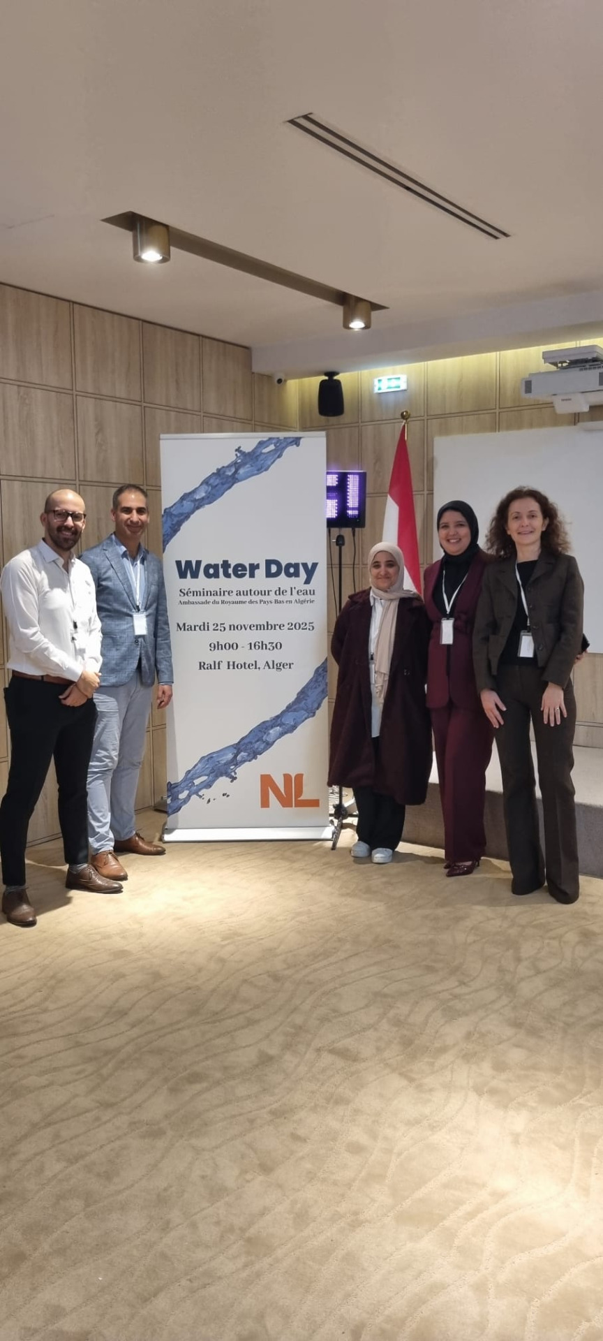
Lack of time today, as I was attending a very nice Water Day seminar organised by the Dutch Embassy in Algiers. Still, I managed to put together a quick map for the challenge.
I used the Kontur Population Density dataset from the Humanitarian Data Exchange (HDX). This dataset provides population counts at 400 m H3 hexagon resolution, creating a consistent grid that makes comparisons and visualization straightforward.
It fuses multiple sources into one coherent dataset:
GHSL (Global Human Settlement Layer)
Facebook population estimates
Microsoft Buildings data
Copernicus Global Land Service
LINZ (Land Information New Zealand)
OpenStreetMap
Day 26: Transport
Still in Algeria, and with limited time for sophisticated cartography, I turned to a quick but effective workflow: combining vector tiles from the MapTiler plugin with OpenStreetMap data in QGIS to visualize public transport in Algiers, the capital of Algeria.
The Algiers Metro is a fascinating system with a unique story:
It's the second metro system in Africa, after Cairo.
The metro opened in 2011, following nearly three decades of planning and delays.
It currently runs along a single line of 18.5 km with 19 stations.
Each year, it serves around 46 million riders, making it a vital part of Algiers' urban mobility.
Day 27: Boundaries
For today's theme, I turned to one of the most critical yet often invisible boundaries beneath our feet: transboundary aquifers. These underground water reserves cross national borders, reminding us that boundaries are not only lines on a map, they are shared responsibilities.
Using the 2025 global dataset from IGRAC, I mapped aquifers that extend across multiple countries. The visualization highlights how groundwater systems connect communities in ways that political borders often overlook.
The background elevation map is from Mapzen Global Terrain. It was added to provide some reference and for esthetic reasons, however, the colours make the transboundary catchment polygons a bit less readable.
Day 28: Black
On this Black Friday, while traveling back to the Netherlands from Algeria, I needed a quick solution for today's theme. The answer lay in the depths of the Black Sea.
The workflow:
- Data source: Used the OpenTopography DEM Downloader plugin to access the Global Bathymetry SRTM15+ V2.1 dataset.
- Processing: Calculated 100 m interval contours to capture the depth variations.
- Styling: Applied the Tanaka method for shaded relief, giving the bathymetry a textured, dramatic look. For efficiency, I've downloaded a ready-made style from the QGIS Style Hub via the QGIS Hub plugin to speed up the workflow.
More info about the QGIS Resources Hub and the QGIS Hub plugin:
Day 29: Raster
Raster data often comes with quirks. Interpolated LiDAR DSMs (Digital Surface Models) typically leave voids (nodata) at water bodies. That's a problem when you want to model building shadows, because those gaps break the continuity of the surface.
For today's challenge, I tackled this issue in Rotterdam, using the 0.5 m AHN4 DSM downloaded through the PDOK Services plugin. I've used my PyQGIS processing script from the QGIS Resources Hub.
Day 30: Makeover
For today's theme, I've kept things simple. I'm currently traveling to Marrakech, Morocco for a trade mission on water from the Dutch government and the XIX World Water Congress, so time is limited once again.
I revisited my Day 2 map and gave it a makeover: I restored the Schie, Coolsingel, and Goudsesingel back into water bodies. The adjustment highlights how a stronger blue infrastructure can contribute to climate adaptation measures in urban environments.
It's a modest change, but one that underscores the importance of water in shaping resilient cities. A theme that resonates strongly with my work and this week's mission in Morocco.
